In a crowded digital world where attention spans are short and visual noise is everywhere, consistency is king. Shlomo Smith, the acclaimed graphic designer from Lakewood, NJ, and a graduate of Rutgers University, has long emphasized the power of cohesive visual branding. His approach—rooted in structure, repetition, and clarity—helps brands stand out by staying unmistakably recognizable across every medium.
Below, Smith shares his top insights on maintaining visual consistency in brand design.
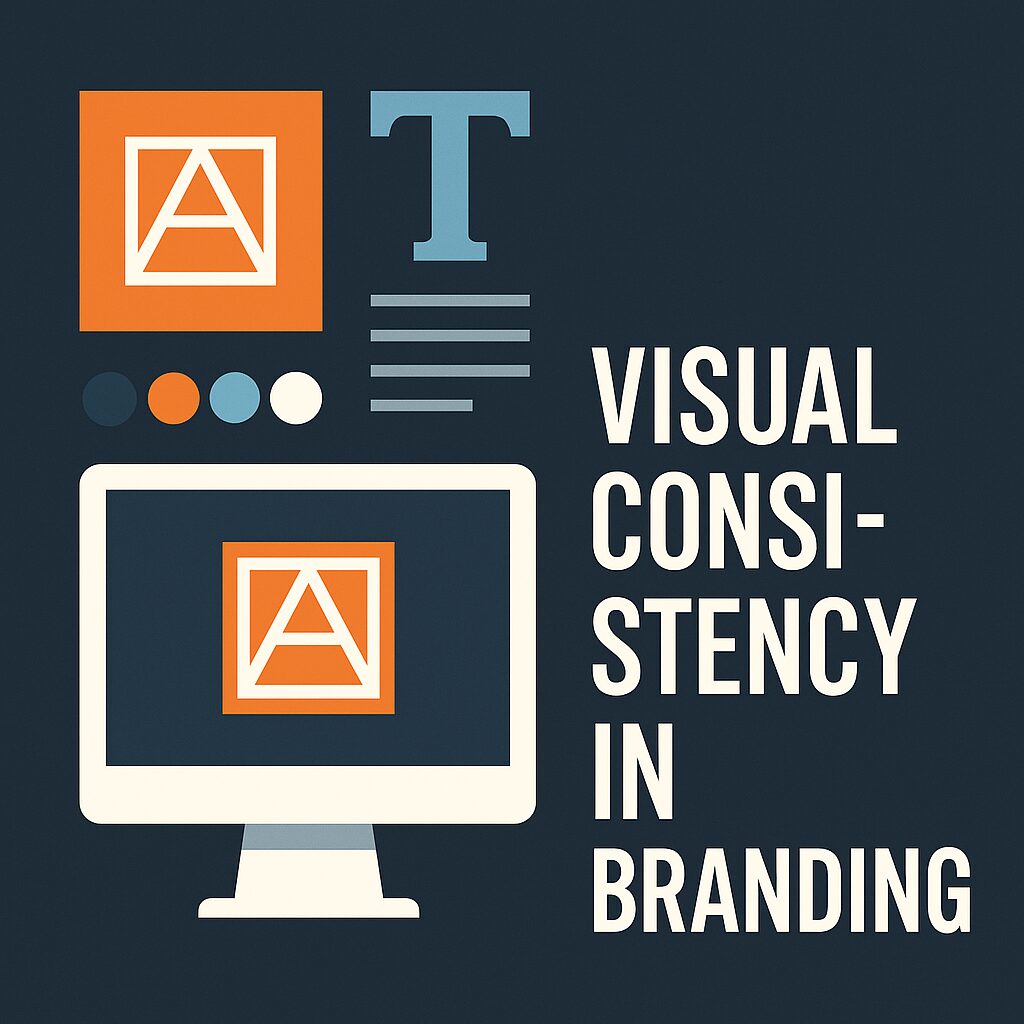
1. Start with a Unified Brand System
Smith believes every great brand starts with a clearly defined design system: logos, fonts, colors, icons, layout rules, and tone of imagery. Without this, inconsistency creeps in quickly, especially as teams grow.
“Your brand isn’t just what you say—it’s how you look when you say it, and how often you say it that way,” Smith notes.
You can see examples of full visual identity kits designed by Smith on his Behance portfolio, where each project includes detailed mockups that demonstrate consistent use across social media, websites, and packaging.
2. Define Color and Typography Rules Early
Color and typography are two of the most powerful identifiers in branding, and according to Smith, they should never be chosen arbitrarily.
He recommends choosing:
- 1–2 primary colors for recognition.
- 2–3 secondary/accent colors.
- A heading font and body font that complement each other and fit the brand’s voice.
Smith discusses the psychology behind color in depth through some of his visual storytelling work, also shared on Instagram, where he often posts case studies and tips for maintaining brand tone through palette discipline.
3. Apply Across All Touchpoints Consistently
True consistency, Smith says, is proven in how branding is applied—not just designed.
- Website headers should reflect the same spacing and typographic rules as brochures.
- Social media graphics should echo print materials in layout and color.
- Packaging should extend the brand’s message without deviation.
His art-based compositions that mirror branding principles—showing disciplined repetition and visual structure—can be found on Pictorem, where abstract design is still tied together by color rhythm and form continuity.
4. Audit Regularly and Re-Calibrate
Even with guidelines in place, drift is common. Smith suggests performing brand audits quarterly to identify inconsistencies and update guidelines where needed.
“Brands are living systems,” he explains. “Consistency doesn’t mean rigidity. It means intentional alignment across every expression.”
Conclusion: Consistency Builds Trust
According to Shlomo Smith, visual consistency is the most practical way to build familiarity and trust. People associate consistency with reliability—and that association translates directly into brand loyalty.
Whether designing a full brand system or refining an existing one, Smith’s advice remains timeless: define your rules, live by them, and adjust only with purpose. The result? A brand that’s recognizable, memorable, and impossible to ignore.